Jack's Point
Close
×
Brand, Website, Marketing


Recreational developed the brand identity for Jack's Point centred on creating a sense of place. This is a benchmark project for Recreational in building and communicating a brand identity for New Zealand’s largest private resort infrastructure, commercial and residential development project.
We have worked on this $2 billion project since its inception, from its planning phase, through to the delivery of a new village, multiple residential neighbourhoods, and a championship golf course. The knowledge gained has provided us with an exceptional insight into large-scale development projects, and how to build and communicate a brand identity in concert with that.
We have worked on this $2 billion project since its inception, from its planning phase, through to the delivery of a new village, multiple residential neighbourhoods, and a championship golf course. The knowledge gained has provided us with an exceptional insight into large-scale development projects, and how to build and communicate a brand identity in concert with that.


The brand of Jack's Point encompasses many elements, not just a logo. The unique New Zealand location is the identity.
The natural alpine environment informed the selection of colours and typeface design for Jack's Point. Cool grey tones from the mountain ranges above Jack's Point graduate down to warmer earth tones and tussock grasses. Swathes of green weave across the landscape and golf course to the deep blue of the lake.
Sharp angular edges are prevalent across the panoramic views of The Remarkables mountain range, running north to south. This definition is picked up in the typeface Signifier, used for headlines.
While there are specific rules around the brand, with documented guidance, the Jack's Point website acts as the master brand guideline, illustrating design execution and tone of voice.
Like the physical assets of Jack's Point, the brand is also considered a core asset with a distinct value, and as such, strict licensing rules around its use were put in place for its long term protection.


The website and marketing collateral creates a visual language that connects precincts, activities, and environment. Contours are a significant feature of the Jack’s Point landscape, speaking to the form and function of the land. A contour pattern in varying layouts and colour themes visually connects the website content.
The choice of the ‘Roman’ style typeface for primary headlines contrasts with the body of the website text, creating focus. The font used is called ‘Signifier’ from the New Zealand type foundry, Klim. Chosen for its distinct rounded and sharp edges, ‘Signifier’ draws a connection with the curving glacially formed valley of Jack’s Point and the schist rock of The Remarkables.
The choice of the ‘Roman’ style typeface for primary headlines contrasts with the body of the website text, creating focus. The font used is called ‘Signifier’ from the New Zealand type foundry, Klim. Chosen for its distinct rounded and sharp edges, ‘Signifier’ draws a connection with the curving glacially formed valley of Jack’s Point and the schist rock of The Remarkables.


Recreational developed brand guidelines that set some boundaries, while also providing for a development that is ever-evolving. However, the logo is a set centrepiece of the brand, with its unique diamond shape icon.
The icon is representative of this dramatic alpine landscape, capturing its hard edges formed from millions of years of glacial activity and geological upheavals. The design is intended to act as a distinct visual marker. Paired with a handmade typeface, the logo lockup is now synonymous with the location.
At the core of this design are some rules for the position of the logo lockup in relation to other visual elements such as text or graphics. The horizontal alignment should have a space of ‘Z’ on the left and right of the logo. The vertical alignment should have a space of ‘X’ on the top and bottom of the logo.


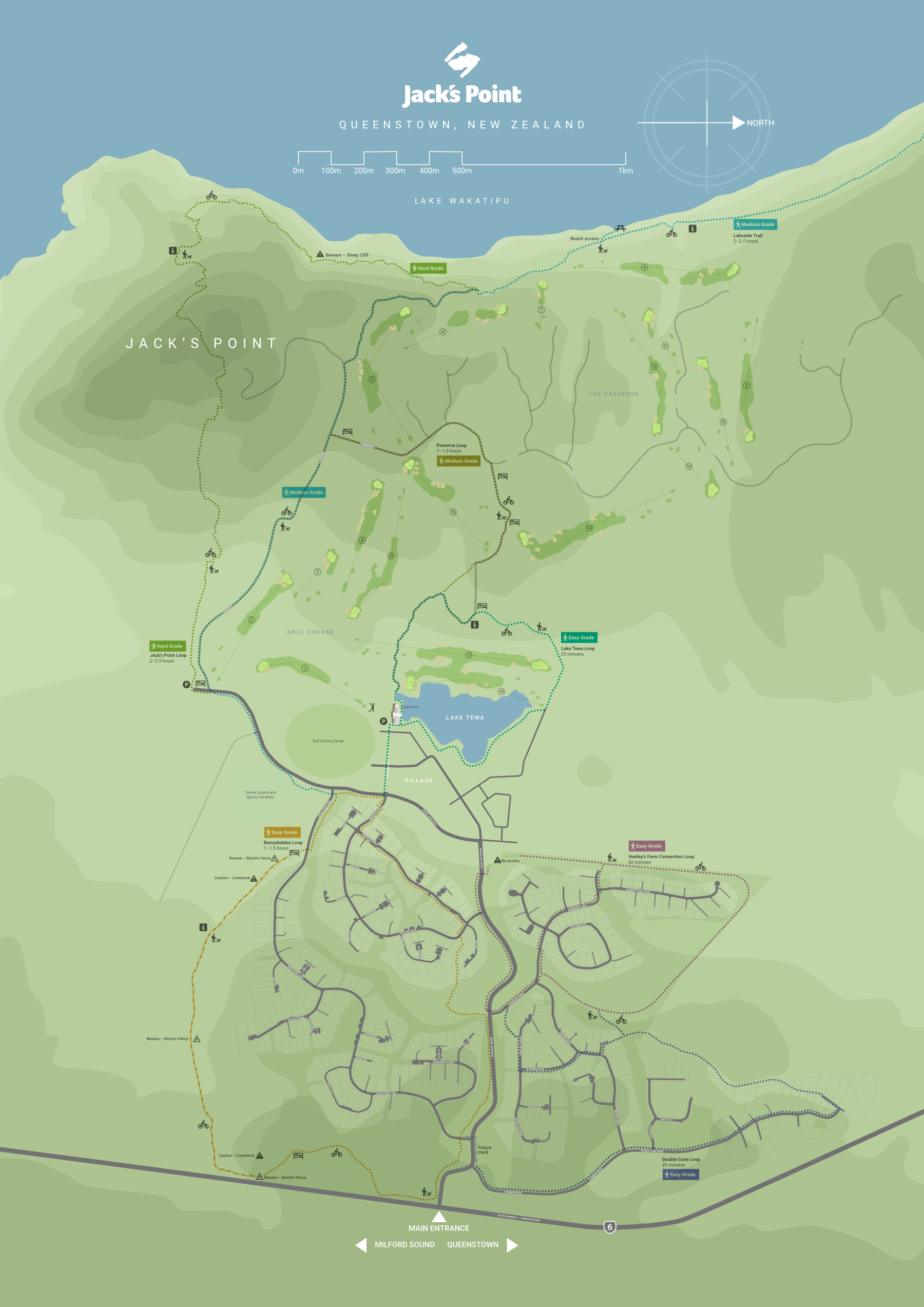
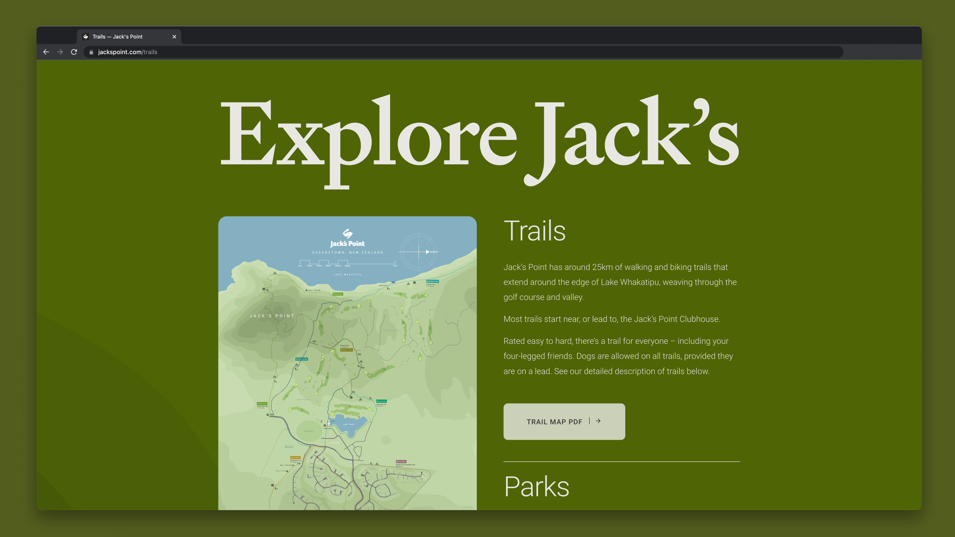
Working closely with the development planners at Jack's Point, Recreational developed a range of marketing and communication assets, from masterplan graphics and trail maps to substantial planning submission documents.
Not only must the information be communicated accurately, it must be accessible, which requires thoughtful document design. Recreational has extensive experience in working alongside clients to develop specialised information packages in print or online.
Not only must the information be communicated accurately, it must be accessible, which requires thoughtful document design. Recreational has extensive experience in working alongside clients to develop specialised information packages in print or online.


